

Universal Custom Carousel Guide
The Universal Custom Carousel (named Custom Carousel in the Shopify Theme Editor) is the most flexible block in Cubic Carousel. It can be embedded into any template across your store — including Home, Collection, Product, Cart, and custom landing pages.
1. Advanced Data Sources & Cart Matching
Section titled “1. Advanced Data Sources & Cart Matching”Unlike standard product carousels that only show fixed collections, the Custom Carousel connects directly to Cubic Carousel’s recommendation logic with smart contextual overrides:
| Setting ID | Type | Default | Description |
|---|---|---|---|
handpicked_collections |
collection_list |
None | Display Collections (Category Slider): Switches the carousel into a visual collection navigator — displays collection cards linking directly to collection pages instead of showing individual products. |
collection_products_override |
collection |
None | Products from Collection: Lock the carousel to display products belonging strictly to a single chosen collection. |
handpicked_products |
product_list |
None | Manually select specific products to populate the carousel. |
base_product |
product |
None | Designates a specific product as the “anchor” for recommendation logic. Useful on Home or Landing pages to promote matching accessories for a flagship item. |
use_cart_first_product |
checkbox |
false |
Cart-Aware Recommendations: Automatically reads the first product currently inside the shopper’s cart and recommends complementary products in real time. Perfect for Cart pages and Cart Drawers. |
max_products |
number |
10 |
Maximum number of product or collection cards loaded into the track. |
enable_first_card |
checkbox |
true |
Renders the Pinned/Featured Card configured in your Cubic Carousel Builder. |
Collection Showcase Mode (Category Slider)
Section titled “Collection Showcase Mode (Category Slider)”When you choose collections in Display Collections (handpicked_collections), the Custom Carousel functions as a dedicated Category Slider:
- Visual Cards: Each card features the collection’s primary cover image (or the first product’s photography if no collection image is uploaded) and the collection title.
- Automatic Price Hiding: Because collections represent whole catalogs rather than a single SKU, price badges are cleanly hidden.
- Inline or Sticky: You can place this category slider directly on your Home page (inline) to highlight top shopping departments, or make it Sticky at the top or bottom of your store for effortless category browsing.
2. Layout Modes: Inline vs. Sticky
Section titled “2. Layout Modes: Inline vs. Sticky”The Custom Carousel features a dual-mode layout engine controlled by the layout_behavior setting:
Inline Mode (layout_behavior = inline)
Section titled “Inline Mode (layout_behavior = inline)”Integrates natively into the document flow of your page, sitting between your theme’s native sections.
- Orientation (
orientation):horizontal: Standard sliding carousel track with touch swipe and navigation chevrons.vertical: Stacked column format — ideal for narrow sidebars, multi-column desktop grids, or cart drawer sidebars.
- Visible Items (
visible_items): Set an exact count of items displayed at once, or set to0for auto-responsive sizing based on container width. - In-Page Spacing (
inline_margin_top&inline_margin_bottom): Range0pxto200px(step:2px). Allows pixel-perfect vertical separation from surrounding sections without touching CSS.
Sticky Mode (layout_behavior = sticky)
Section titled “Sticky Mode (layout_behavior = sticky)”Transforms the carousel into an independent floating widget locked to the customer’s viewport on the specific page where the block is added.
3. Sticky Mode Configuration Reference
Section titled “3. Sticky Mode Configuration Reference”When layout_behavior is set to sticky, the Custom Carousel activates the full floating engine:
Screen Alignment & Geometry
Section titled “Screen Alignment & Geometry”| Setting ID | Type | Default | Description |
|---|---|---|---|
desktop_enabled / mobile_enabled |
select |
enable |
Enable or disable per device (enable, disable). |
position / mobile_position |
select |
bottom |
Screen edge anchor: top, bottom, left, right. |
desktop_h_align / mobile_h_align |
select |
center |
Alignment along screen edge: left, center, right. |
desktop_length / mobile_length |
range |
100% |
Width percentage across the screen (10% – 100%). |
mobile_vert_offset |
number |
25px |
Safe clearance for mobile bottom navigation bars. |
| Edge & Side Offsets | number |
0px |
Independent pixel offsets for top/bottom (edge_offset) and left/right (side_offset). |
Compact Bubble Mode
Section titled “Compact Bubble Mode”| Setting ID | Type | Default | Description |
|---|---|---|---|
compact_mode_desktop / compact_mode_mobile |
checkbox |
false |
Collapse widget into a sleek floating bubble when resting. |
desktop_resting_size / mobile_resting_size |
number |
80px |
Resting bubble dimensions. |
desktop_active_size / mobile_active_size |
number |
120px / 110px |
Expanded active item dimension. |
extend_hover |
checkbox |
true |
Expand to full carousel width on desktop mouse hover. |
mobile_extend_swipe |
checkbox |
true |
Expand to full width on mobile touch swipe. |
inactivity_reset_timeout |
number |
2s |
Inactivity delay before collapsing back to resting state. |
4. Trigger Engine & Motion Controls
Section titled “4. Trigger Engine & Motion Controls”Control entry timing and automated motion:
- Triggers (
trigger_type):scroll: Reveals after scrollingtrigger_scroll_depth(default:200px).time: Reveals aftertrigger_delay(default:3s).atc: Triggers when the shopper scrolls past the Add-to-Cart form.
hide_on_scroll_up(checkbox, defaulttrue): Auto-hides on reverse scroll.- Continuous Marquee (
marquee_enabled&marquee_speed): Smooth infinite loop ticker motion. - Auto-Slide Interval (
auto_slide_interval): Stepped interval (seconds) when continuous marquee is off. interaction_resume_delay(number, default2s): Resumes automated motion after customer touch or drag.
5. Design, Price Badges & Styling
Section titled “5. Design, Price Badges & Styling”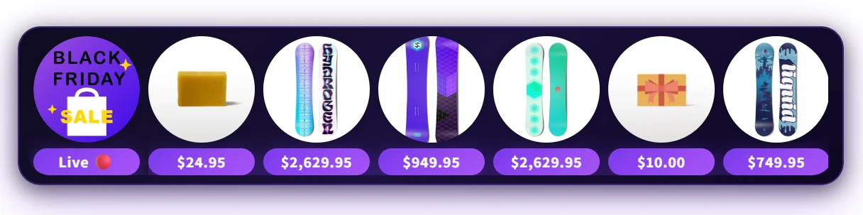
- Price Badges:
show_price_desktop,show_price_mobile,price_size,price_size_mobile,price_bg_color,price_text_color,price_border_radius. - Card Silhouette:
image_shape(squareorcircle),crop_images(fill frame fully),image_bg_color. - Borders & Backgrounds:
bg_color,border_color,border_thickness(0–20px),border_radius(0–100px). - Presets & Custom CSS:
settings_preset: Quick-select from built-in presets (preset_1topreset_4, orcustom).preset_json: Import ready-made design configurations from our Presets Library.custom_css: Scoped CSS applied directly to this block instance.