

Related Products Slider Guide
The Related Products Slider (named Related Products Slider in the Shopify Theme Editor) is an interactive, horizontal product carousel engineered specifically for Shopify Product Pages. It transforms standard “You may also like” sections into high-converting recommendation engines backed by your rules from the Cubic Carousel Builder.
1. Heading & Recommendation Count
Section titled “1. Heading & Recommendation Count”| Setting ID | Type | Default | Description |
|---|---|---|---|
section_title |
text |
"You may also like" |
Section headline displayed above the slider. |
title_alignment |
select |
left |
Heading alignment: left or center. |
max_products |
number |
10 |
Maximum number of recommended products loaded into the slider track. |
settings_preset |
select |
preset_1 |
Quick style preset: preset_1, preset_2, preset_3, preset_4, or custom. |
2. Card Layout, Geometry & Sizing
Section titled “2. Card Layout, Geometry & Sizing”Configure the physical dimensions, image proportions, and whitespace of your recommendation cards:
| Setting ID | Type | Default | Options / Range | Description |
|---|---|---|---|---|
box_width |
number |
200px |
Integer | Width of each product card in pixels. |
gap_size |
number |
20px |
Integer | Space (gutter) between product cards. |
image_ratio |
select |
adapt |
adapt, square, portrait |
Aspect Ratio: • adapt: Natural image proportions.• square: Uniform 1:1 square.• portrait: Modern 4:5 vertical portrait. |
show_secondary_image |
checkbox |
false |
Boolean | Automatically flips to the product’s secondary image when a shopper hovers over the card. |
image_shape |
select |
square |
square, circle |
Image container shape (square or circular silhouette). |
title_truncate_words |
number |
0 |
Integer | Truncates long product titles to N words with ellipsis (...). Set to 0 to display full titles. |
padding_top |
range |
36px |
0px – 100px (step: 4px) |
Vertical padding above the slider section. |
padding_bottom |
range |
36px |
0px – 100px (step: 4px) |
Vertical padding below the slider section. |
3. Motion & Animation: Marquee vs. Auto-Slide
Section titled “3. Motion & Animation: Marquee vs. Auto-Slide”The slider includes both classic auto-sliding and silky-smooth continuous marquee physics:
| Setting ID | Type | Default | How It Works |
|---|---|---|---|
marquee_enabled |
checkbox |
false |
Smooth Continuous Motion: Enables a seamless infinite marquee loop that glides steadily without stopping. |
marquee_speed |
number |
5 |
Speed in seconds per cycle when marquee is enabled. Lower numbers create faster scrolling. |
auto_slide_interval |
number |
1s |
Stepped transition interval (seconds between card advances) when continuous marquee is disabled. |
4. Price & CTA Positioning Matrix
Section titled “4. Price & CTA Positioning Matrix”Cubic Carousel offers unparalleled control over how product pricing and call-to-action buttons are positioned on each card via the price_cta_layout setting:
Layout Modes (price_cta_layout)
Section titled “Layout Modes (price_cta_layout)”side_by_side(Default):- Places the product price and CTA button together on the same horizontal row below the title.
- Distance between price and button is controlled by
price_cta_distance(default8px).
top_bottom:- Stacks the price badge directly on top of the CTA button in a vertical arrangement.
float_on_image:- Removes the price from below the card and floats it as a stylish pill badge directly over the product photography.
- Floating Anchors (
price_float_position): Choose from 6 anchor positions:top_left,top_center,top_rightbottom_left,bottom_center,bottom_right
- Image Border Offset (
price_float_offset): Sets the distance (default8px) between the floating badge and the edge of the image.
5. Typography, Colors & Button Styling
Section titled “5. Typography, Colors & Button Styling”Fine-tune typography sizes and brand colors directly in the block schema:
Section & Product Titles
Section titled “Section & Product Titles”heading_color(color, default#1e293b) &heading_size(range,14px–48px, default22px): Main section title.title_color(color, default#1e293b) &title_size(range,8px–24px, default14px): Product card title.
Price Badges
Section titled “Price Badges”show_price(checkbox, defaulttrue): Toggle pricing visibility.price_text_color(color, default#5ca300) &price_bg_color(color, defaulttransparent).price_size(range,8px–24px, default14px): Price font size.price_border_radius(range,0px–50px, default4px): Badge corner radius.
Call-to-Action (CTA) Buttons
Section titled “Call-to-Action (CTA) Buttons”show_button(checkbox, defaulttrue): Toggle CTA button visibility.cta_text(text, default"Buy Now"): Button label (e.g., “Add to Cart”, “Quick Buy”, “View Product”).cta_bg_color(color, default#2271b1) &cta_text_color(color, default#ffffff).cta_size(range,8px–24px, default13px): Button typography size.cta_border_radius(range,0px–50px, default4px): Button corner curvature.
Card & Section Backgrounds
Section titled “Card & Section Backgrounds”card_bg_color(color, default#ffffff): Individual card background.bg_color(color, defaulttransparent): Outer section background.
6. Presets & Custom CSS
Section titled “6. Presets & Custom CSS”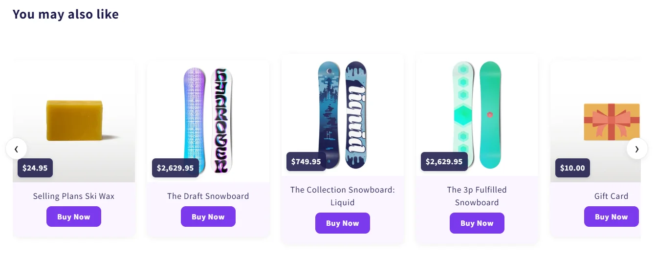
- Preset JSON Code (
preset_json): Paste any JSON preset from our Presets Library to replicate pre-designed slider aesthetics instantly. - Custom CSS (
custom_css): Inject custom CSS scoped directly to this slider block instance without modifying theme liquid files.