

Global Sticky Bar Guide
The Global Sticky Bar is an ambient, persistent product recommendation widget that anchors to the edge of the shopper’s viewport. Powered by Cubic Carousel’s recommendation engine, it follows visitors across pages to drive high-converting cross-sells and upsells without disrupting the browsing experience.
1. Content & Data Sources
Section titled “1. Content & Data Sources”By default, the Sticky Bar automatically queries your dynamic sequence from the Cubic Carousel Builder (matching tags, collections, cross-sell rules, and fallbacks). You can also override or supplement this behavior directly within the block settings:
| Setting ID | Type | Default | Description |
|---|---|---|---|
handpicked_products |
product_list |
None | Manually choose specific products to display across the bar. |
handpicked_collections |
collection_list |
None | Display Collections (Category Bar): Transforms the bar into a visual collection navigator — displays collection cards/bubbles linking directly to collection pages instead of individual products. |
collection_products_override |
collection |
None | Products from Collection: Lock recommendations to show products belonging to a single chosen collection. |
enable_first_card |
checkbox |
true |
Displays your Pinned/Featured Card configured in the Cubic Carousel Builder. |
Showcase Collections Instead of Products (Sticky Category Bar)
Section titled “Showcase Collections Instead of Products (Sticky Category Bar)”You can turn the Global Sticky Bar into a persistent Floating Category Bar or Department Navigator:
- How It Works: In the Display Collections (
handpicked_collections) field, pick the collections you want to highlight (e.g. New Arrivals, Hoodies, Footwear, Summer Sale). - Automatic Visuals: Each bubble or card displays the collection’s featured image (or the first product’s photo if no collection image is set) along with the collection title.
- Smart Price Suppression: Because collections do not have a single price, price badges are cleanly suppressed automatically.
- 1-Tap Navigation: Clicking any bubble instantly navigates the shopper to
/collections/<handle>. - Mobile Dock Use Case: Creates an app-like bottom navigation dock allowing shoppers to hop between departments from any page on your store.
2. Screen Visibility & Responsive Positioning
Section titled “2. Screen Visibility & Responsive Positioning”Configure distinct screen positions, alignments, and viewport behaviors for Desktop and Mobile shoppers:
Desktop Settings
Section titled “Desktop Settings”| Setting ID | Type | Default | Options / Range | Description |
|---|---|---|---|---|
desktop_enabled |
select |
enable |
enable, disable |
Toggle sticky bar visibility on desktop screens. |
position |
select |
bottom |
top, bottom, left, right |
Anchor position on the desktop viewport. |
desktop_h_align |
select |
center |
left, center, right |
Horizontal alignment along top or bottom anchors. |
desktop_length |
range |
100% |
10% – 100% (step: 5%) |
Resting track length/width as a percentage of the screen width. |
desktop_edge_offset |
number |
0px |
Integer | Distance from top or bottom screen edge. |
desktop_side_offset |
number |
0px |
Integer | Distance from left or right screen edge. |
desktop_vert_offset |
number |
0px |
Integer | Vertical offset adjustment (useful to clear chat widgets). |
Mobile Settings
Section titled “Mobile Settings”| Setting ID | Type | Default | Options / Range | Description |
|---|---|---|---|---|
mobile_enabled |
select |
enable |
enable, disable |
Toggle sticky bar visibility on mobile devices. |
mobile_position |
select |
bottom |
top, bottom, left, right |
Anchor edge on mobile viewports. |
mobile_h_align |
select |
center |
left, center, right |
Horizontal alignment across the mobile screen. |
mobile_length |
range |
100% |
10% – 100% (step: 5%) |
Resting width percentage across the mobile screen. |
mobile_vert_offset |
number |
25px |
Integer | Default vertical offset to clear mobile browser address/home bars. |
mobile_edge_offset |
number |
0px |
Integer | Top/bottom edge offset. |
mobile_side_offset |
number |
0px |
Integer | Left/right edge offset. |
3. Compact Mode (Floating Bubble)
Section titled “3. Compact Mode (Floating Bubble)”Compact Mode converts the Sticky Bar into an ultra-discreet floating bubble showing a single featured product when resting, then dynamically unfurls into the full carousel upon interaction.
| Setting ID | Type | Default | Description |
|---|---|---|---|
compact_mode_desktop |
checkbox |
false |
Enables compact bubble mode on desktop viewports. |
compact_mode_mobile |
checkbox |
false |
Enables compact bubble mode on mobile devices. |
desktop_resting_size |
number |
80px |
Width/diameter of the compact bubble on desktop when resting. |
desktop_active_size |
number |
120px |
Width/diameter of the active featured item upon expansion. |
mobile_resting_size |
number |
80px |
Width/diameter of the bubble on mobile screens. |
mobile_active_size |
number |
110px |
Active card dimension on mobile during swipe expansion. |
extend_hover |
checkbox |
true |
Expands the resting bubble to full width when hovering with a mouse on desktop. |
mobile_extend_swipe |
checkbox |
true |
Expands the resting bubble into full track view when swiped on mobile. |
inactivity_reset_timeout |
number |
2s |
Seconds of inactivity before an expanded bubble automatically collapses back to resting size. |
4. Triggers & Scroll Detection
Section titled “4. Triggers & Scroll Detection”Control exactly when the Sticky Bar enters the screen:
| Setting ID | Type | Default | Options | How It Works |
|---|---|---|---|---|
trigger_type |
select |
scroll |
scroll, time, atc |
Primary reveal strategy. |
trigger_scroll_depth |
number |
200px |
Integer | Active when trigger_type = scroll. Appears once the visitor scrolls past this vertical distance. |
trigger_delay |
number |
3s |
Seconds | Active when trigger_type = time. Appears automatically after N seconds on the page. |
| — | — | — | atc |
Appears immediately when the shopper scrolls past the product page’s Add to Cart button. |
hide_on_scroll_up |
checkbox |
true |
Boolean | Slides the bar smoothly out of sight when the visitor scrolls back up, keeping the reading flow distraction-free. |
5. Motion, Auto-Slide & Continuous Marquee
Section titled “5. Motion, Auto-Slide & Continuous Marquee”| Setting ID | Type | Default | Description |
|---|---|---|---|
marquee_enabled |
checkbox |
false |
Enables non-stop continuous marquee loop motion. |
marquee_speed |
number |
5s |
Marquee speed (seconds per complete cycle). Lower values scroll faster. |
auto_slide_interval |
number |
2s |
Stepped slide transition interval (seconds between cards) when marquee is disabled. |
interaction_resume_delay |
number |
2s |
Seconds to pause motion after a customer manually drags, swipes, or hovers over a product card before auto-motion resumes. |
6. Price Badge, Card & Container Styling
Section titled “6. Price Badge, Card & Container Styling”Customize all colors, radii, and price labels directly in the Theme Editor:
Price Badges
Section titled “Price Badges”show_price_desktop/show_price_mobile(checkbox, defaulttrue): Toggle pricing visibility per device.price_size/price_size_mobile(range,8px–24px, default11px): Typography size.price_bg_color(color, default#ffffff): Badge fill color.price_text_color(color, default#000000): Price text color.price_border_radius(range,0px–50px, default4px): Badge corner radius.
Container & Images
Section titled “Container & Images”image_shape(select,squareorcircle): Card image container silhouette.crop_images(checkbox, defaultfalse): Fill the entire image frame without letterbox borders.image_bg_color(color, default#ffffff): Background behind product photography.bg_color(color, default#ffffff): Outer sticky bar background fill.border_color(color, default#e0e0e0): Outline border color.border_thickness(range,0px–20px, default0px): Frame border stroke.border_radius(range,0px–100px, default8px): Outer container corner radius.
7. Presets & Custom CSS
Section titled “7. Presets & Custom CSS”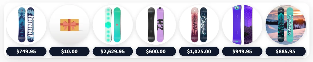
- Style Preset (
settings_preset): Choose from built-in presets (preset_1,preset_2,preset_3,preset_4, orcustom). - Preset JSON Code (
preset_json): Paste any pre-configured JSON snippet directly from our Presets Library to replicate high-converting designs in one click. - Custom CSS (
custom_css): Add scoped CSS overrides applied directly to the#prpdc-sticky-barcontainer without editing theme asset files.