

Related Products Grid Guide
The Related Products Grid (named Related Products Grid in the Shopify Theme Editor) presents dynamic product recommendations in a clean, multi-column tile format directly on Shopify Product Pages. Unlike sliding carousels, this block displays all recommendations simultaneously across structured rows — perfect for high-impact cross-sell sections at the bottom of product pages.
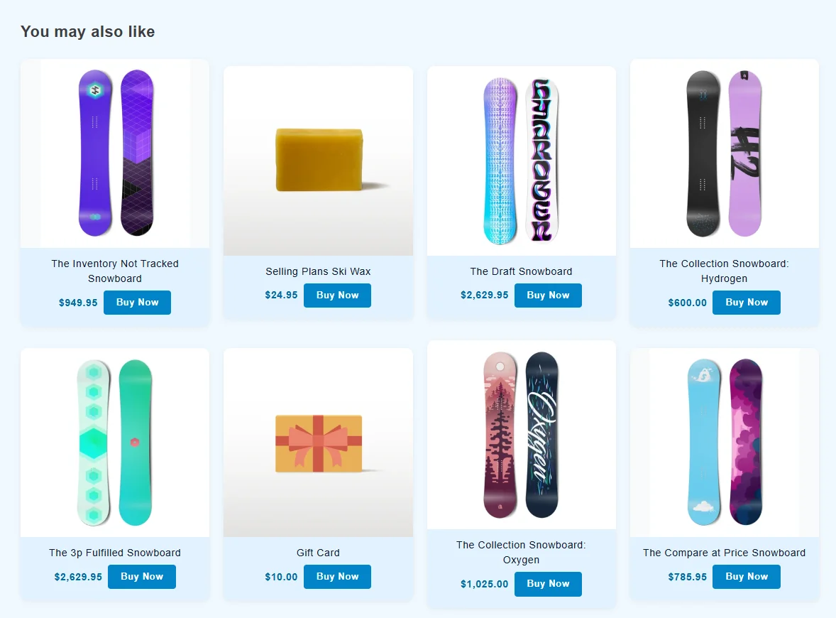
1. Heading & Maximum Products
Section titled “1. Heading & Maximum Products”| Setting ID | Type | Default | Description |
|---|---|---|---|
section_title |
text |
"You may also like" |
Section headline displayed above the product grid. |
title_alignment |
select |
left |
Alignment of the heading: left or center. |
max_products |
number |
8 |
Maximum total products rendered in the grid. |
settings_preset |
select |
preset_1 |
Preset selector: preset_1, preset_2, preset_3, preset_4, or custom. |
2. Responsive Grid Columns & Spacing
Section titled “2. Responsive Grid Columns & Spacing”Customize the number of columns and spacing independently for Desktop and Mobile shoppers:
| Setting ID | Type | Default | Options / Range | Description |
|---|---|---|---|---|
columns_desktop |
range |
4 |
1 – 6 (step: 1) |
Number of product columns per row on desktop screens. |
columns_mobile |
select |
"2" |
"1", "2" |
Mobile Grid Format: • "1": Clean full-width product cards stacked vertically.• "2": Compact 2-column grid layout. |
gap_size |
number |
20px |
Integer | Gutter spacing (in pixels) between product cards both horizontally and vertically. |
padding_top |
range |
36px |
0px – 100px (step: 4px) |
Top section padding. |
padding_bottom |
range |
36px |
0px – 100px (step: 4px) |
Bottom section padding. |
3. Product Card Geometry & Secondary Image Hover
Section titled “3. Product Card Geometry & Secondary Image Hover”| Setting ID | Type | Default | Options | Description |
|---|---|---|---|---|
image_ratio |
select |
adapt |
adapt, square, portrait |
Image Proportions: • adapt: Follows the natural image aspect ratio.• square: Uniform 1:1 square crop.• portrait: Modern 4:5 vertical portrait crop. |
show_secondary_image |
checkbox |
false |
Boolean | Revealing effect that flips to the product’s second gallery image when shoppers hover over the card. |
image_shape |
select |
square |
square, circle |
Shape of the product image container. |
title_truncate_words |
number |
0 |
Integer | Limits product titles to N words followed by ellipsis (...). Set to 0 for full titles. |
4. Price & CTA Positioning Matrix
Section titled “4. Price & CTA Positioning Matrix”The Related Products Grid includes the same flexible Price and CTA layout engine as the slider, controlled by price_cta_layout:
Layout Modes (price_cta_layout)
Section titled “Layout Modes (price_cta_layout)”side_by_side(Default):- Displays the price and CTA button on the same horizontal row below the title.
- Spacing between them is set by
price_cta_distance(default8px).
top_bottom:- Places the price badge centered or aligned directly above the CTA button in a vertical stack.
float_on_image:- Floats the price badge directly over the product image as a pill badge.
- Floating Positions (
price_float_position): Choose from 6 anchor positions:top_left,top_center,top_rightbottom_left,bottom_center,bottom_right
- Floating Offset (
price_float_offset): Distance in pixels from the edge of the image (default8px).
5. Colors, Typography & Button Styling
Section titled “5. Colors, Typography & Button Styling”Fine-tune colors and typography directly in the block settings:
Typography
Section titled “Typography”heading_color(color, default#1e293b) &heading_size(range,14px–48px, default22px): Main grid section heading.title_color(color, default#1e293b) &title_size(range,8px–24px, default14px): Individual product card title.
Pricing Badge
Section titled “Pricing Badge”show_price(checkbox, defaulttrue): Toggle price display.price_text_color(color, default#5ca300) &price_bg_color(color, defaulttransparent).price_size(range,8px–24px, default14px): Price text size.price_border_radius(range,0px–50px, default4px): Price badge corner curvature.
CTA Button
Section titled “CTA Button”show_button(checkbox, defaulttrue): Toggle CTA button display.cta_text(text, default"Buy Now"): Button label (e.g., “Add to Bag”, “Quick View”, “Shop Now”).cta_bg_color(color, default#2271b1) &cta_text_color(color, default#ffffff).cta_size(range,8px–24px, default13px): Button typography size.cta_border_radius(range,0px–50px, default4px): Button border curvature.
Card & Section Backgrounds
Section titled “Card & Section Backgrounds”card_bg_color(color, default#ffffff): Background color of each product tile.bg_color(color, defaulttransparent): Overall section background color.
6. Presets & Custom CSS
Section titled “6. Presets & Custom CSS”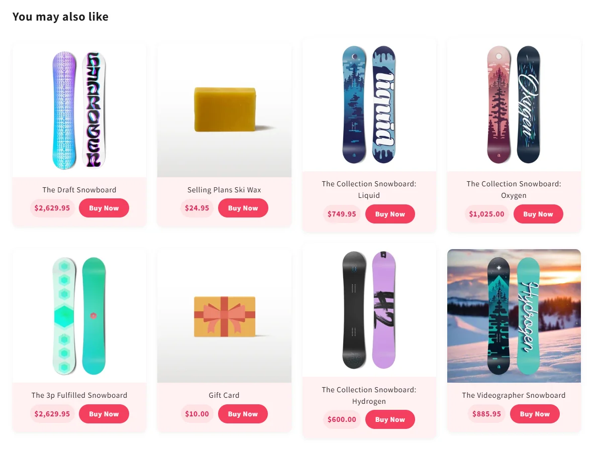
- Preset JSON Code (
preset_json): Paste JSON presets copied from our Presets Library to quickly apply matching typography, badges, and color palettes. - Custom CSS (
custom_css): Write scoped CSS targeting.prpdc-related-grid-wrapwithout touching your theme’s stylesheet files.